Unwinding Anxiety Mobile App Redesign
Unwinding Anxiety by ShareCare
Initial Timeline: 4 Weeks
My Role: Sole UX Designer, Student Project
This is a UX redesign of the Unwinding Anxiety mobile app which Mind Sciences developed at the time (currently known as ShareCare). I worked on this project as a San Francisco State University student while taking an interaction design course in 2019.
Background
I researched the impact of anxiety in the United States and found the following:
The Anxiety and Depression Association of America found that “40 million people in the United States (18%) experience an anxiety disorder in any given year.”
According to the National Comorbidity Survey, people ages 18-44 had the highest percentage of experiencing anxiety. This information was presented by the National Institute of Mental Health.
The Anxiety and Depression Association of America found that “only about one-third of those suffering from an anxiety disorder receive treatment.”
The Problem
The Unwinding Anxiety mobile app has determined that its use can “reduce anxiety by 67%”. However, user interviews with five people (ages 18-44 who experience anxiety) informed me that users are highly unlikely to download the application on their phones. Users mentioned that they felt “the app’s user interface design was not relaxing and not easy to use.”
Solutions
One way to address users’ concerns was to explore a complete user interface redesign of the mobile app using user preferences.
Initial Research
Research Steps
Before diving into the design process, it was crucial to complete the following steps.
Persona Building
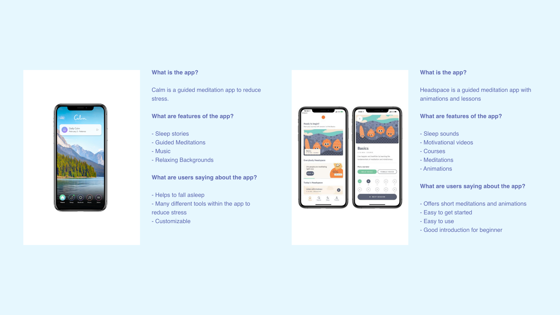
Market Research
User Interviews
Persona Building
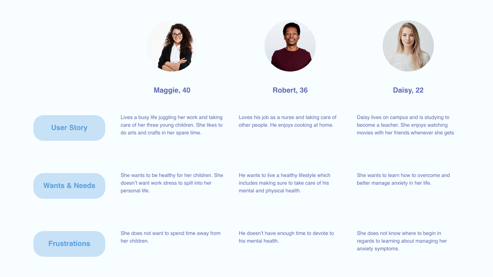
Market Research
User Interviews
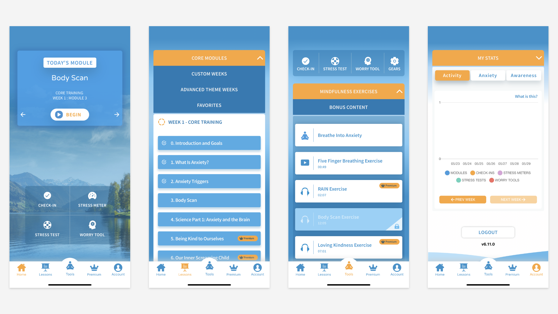
Current App Design
User think-aloud sessions with 5 individuals revealed that users find the current color palette dull and not vibrant, as well as crowded with elements. 80% of participants did not favor the orange and blue color palette.
Design Process
Initial Concepts
The initial concept explored a new color palette and a more simple design.
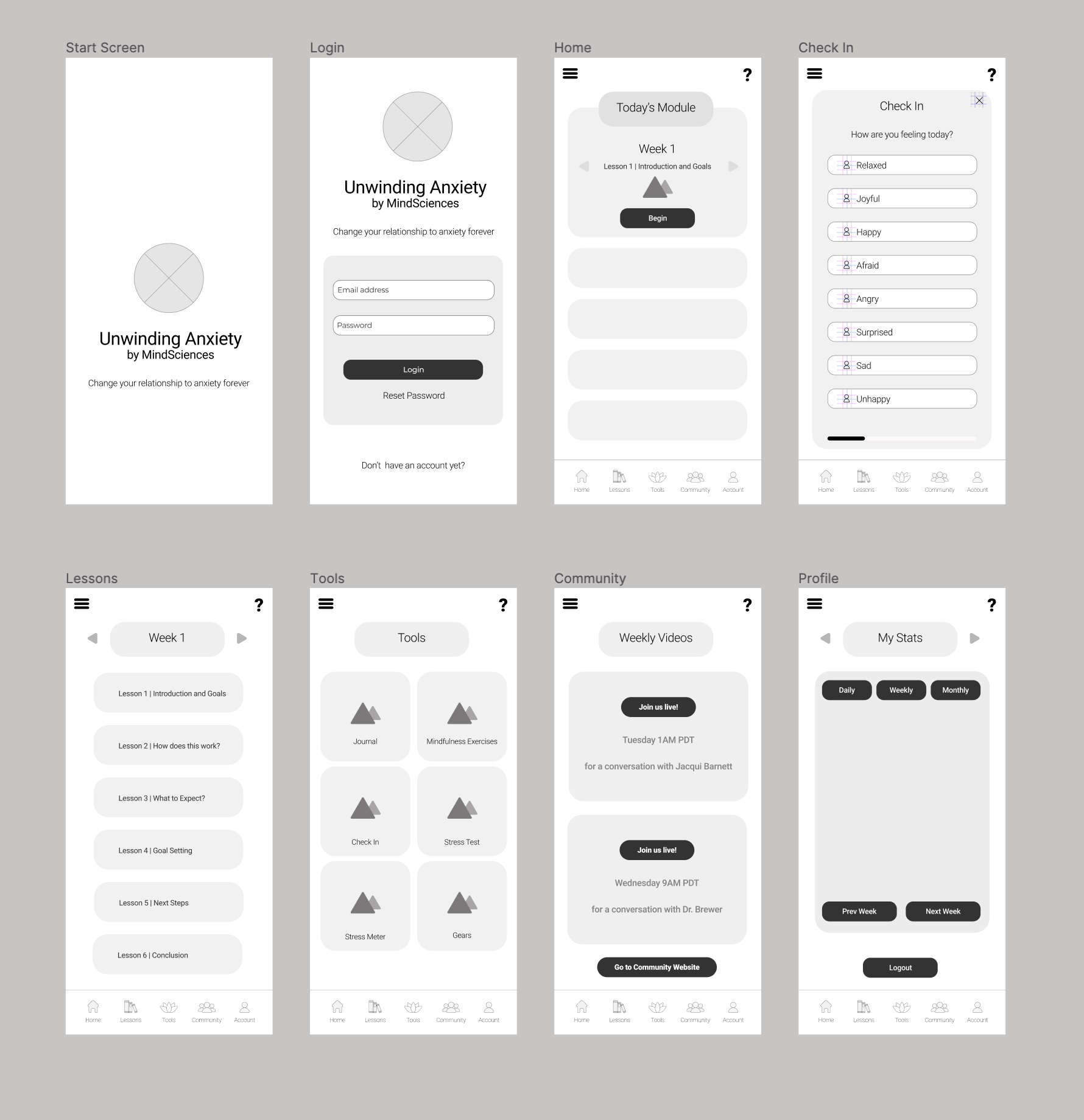
Low-Fidelity Wireframes
Initial wireframes were sketched to observe how users currently navigate the Unwinding Anxiety app.
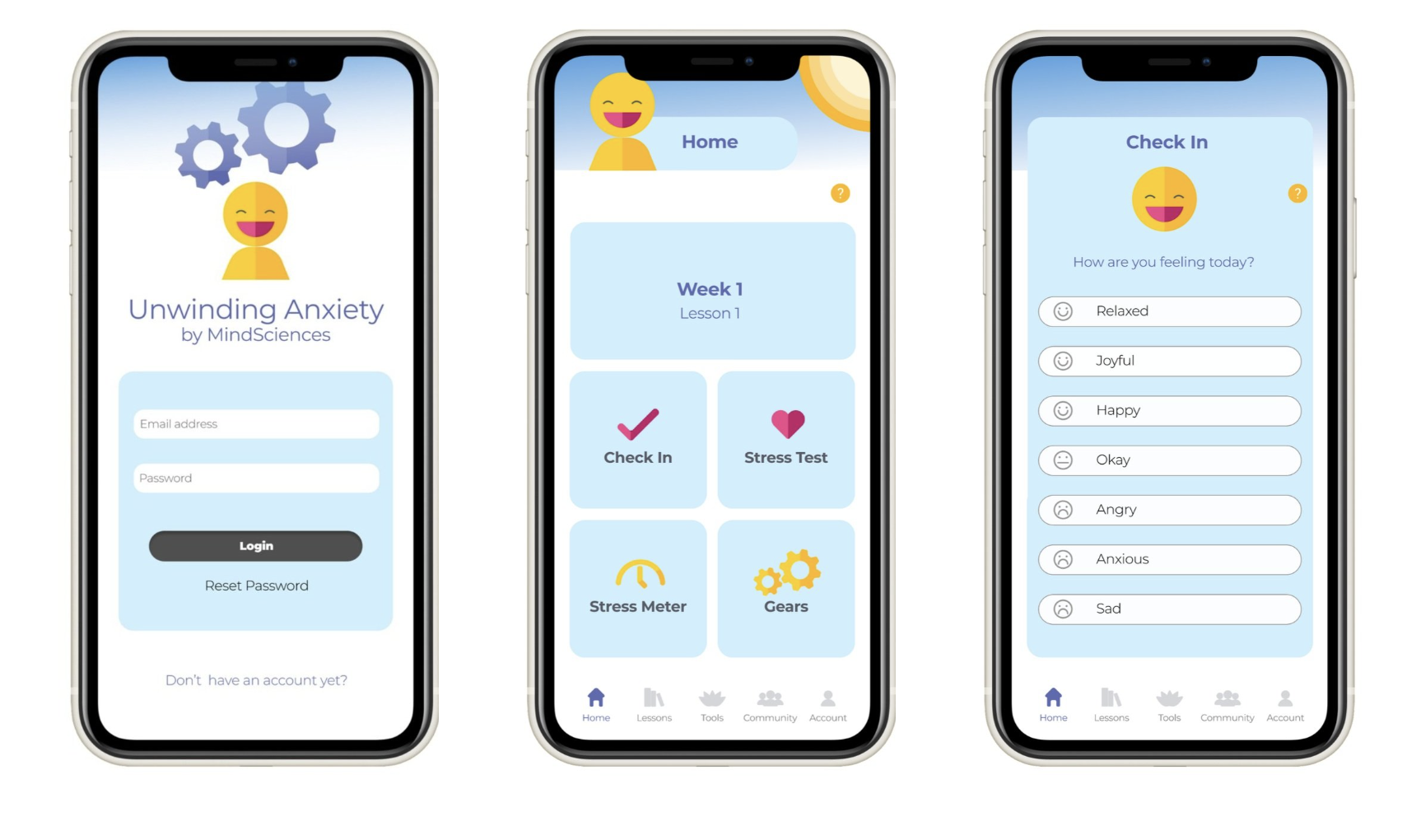
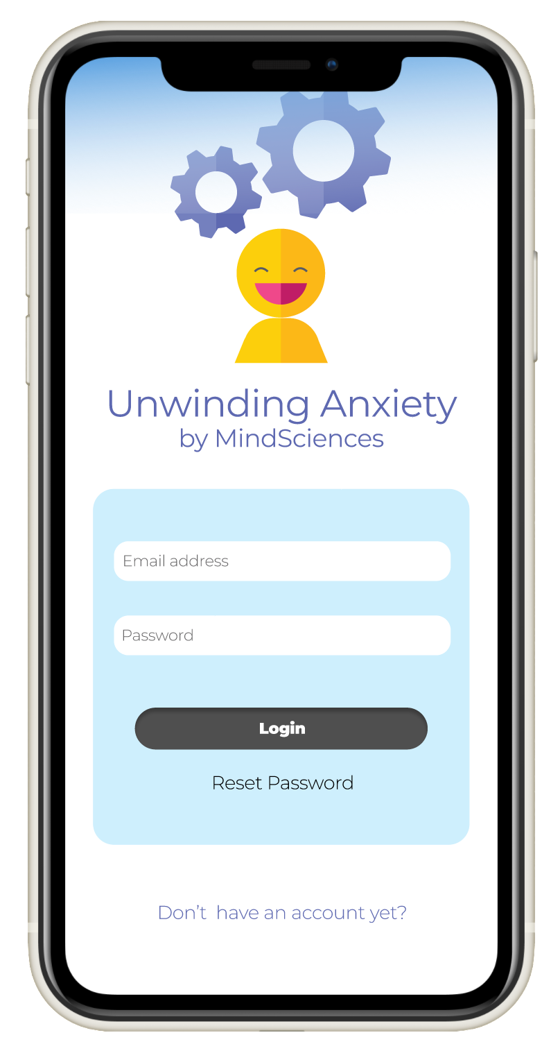
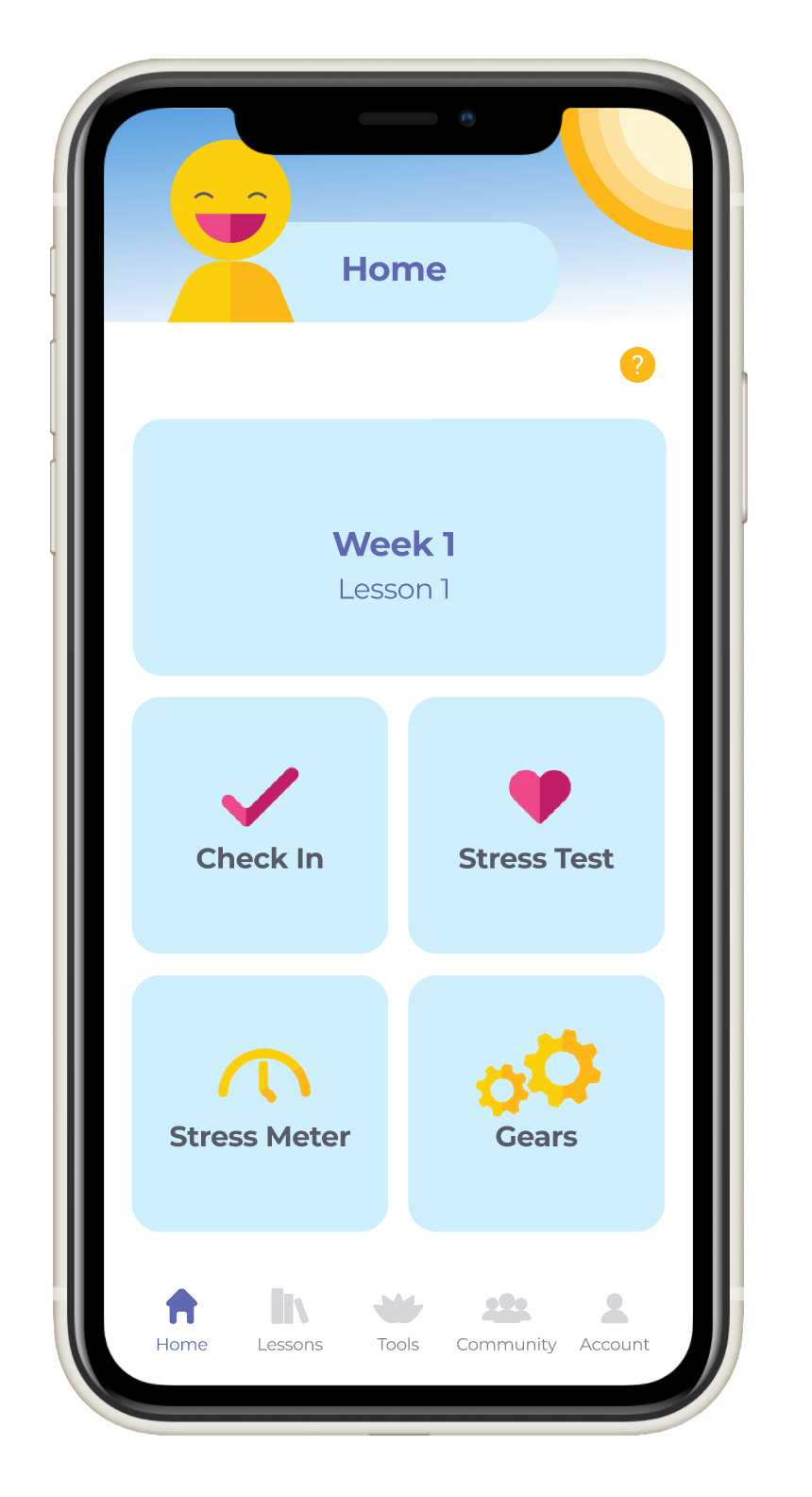
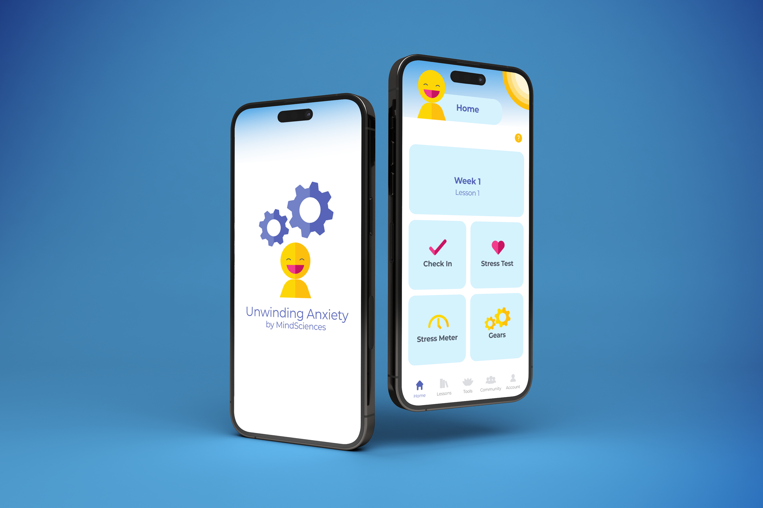
High-Fidelity Wireframes
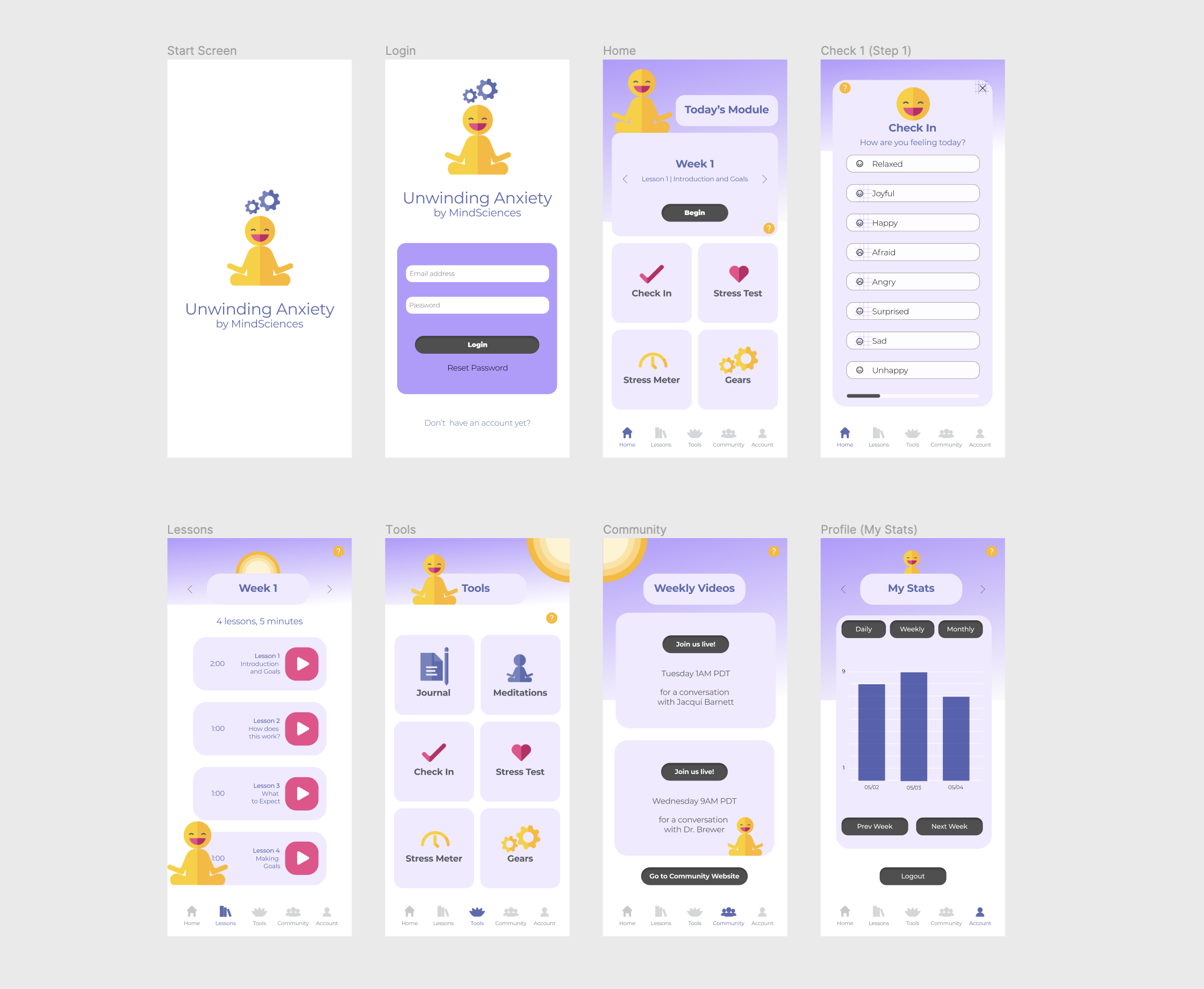
User Testing
The color palette and overall interface design was tested by conducting user think-aloud-sessions with 5 individuals.
More than 50% of users favored a color palette with purples and yellows
However, 3 out of 5 individuals mentioned that they felt the color palette with yellows and purples was too different from the original colors of the mobile application. As a result, I sampled colors from the original app.
One individual stated, “having a character that follows your around would make the app more fun”. This was later tested with a different set of users and the results favored the character graphic.
Final Prototypes